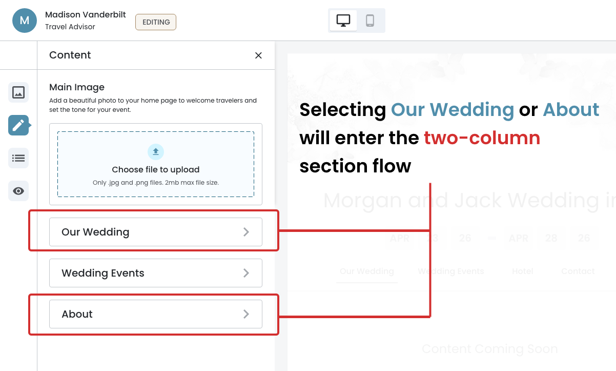
Content, Two‐Column Flow
Building and managing content sections within the Event Website Editor.
In this page
February 24th, 2026
4–Step Progressive Flow
Two Key Constraints
The Two–Column Layout follows a 4–step progressive flow, guiding the user from the main content panel to a fully enabled section form.
Each step builds on the previous:
- Initial State – The user begins at the content panel
- Page Sections Panel – Navigates into the page section manager
- Layout Selector – Selects a layout
- Section Form – The user gains access to the form
Initial State (Constraint #1)
The user begins at the Content Configuration panel.
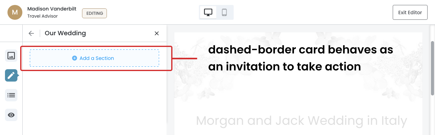
Page Sections Panel
Navigates into the Page Section panel where the user is prompted to add a section.
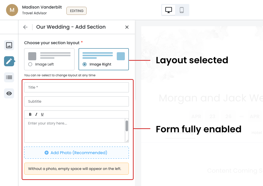
Layout Selector (Constraint #2)
The form is disabled until the user selects a layout — either Image Left or Image Right. The panel header combines the page name and current action to keep the user oriented within the flow.
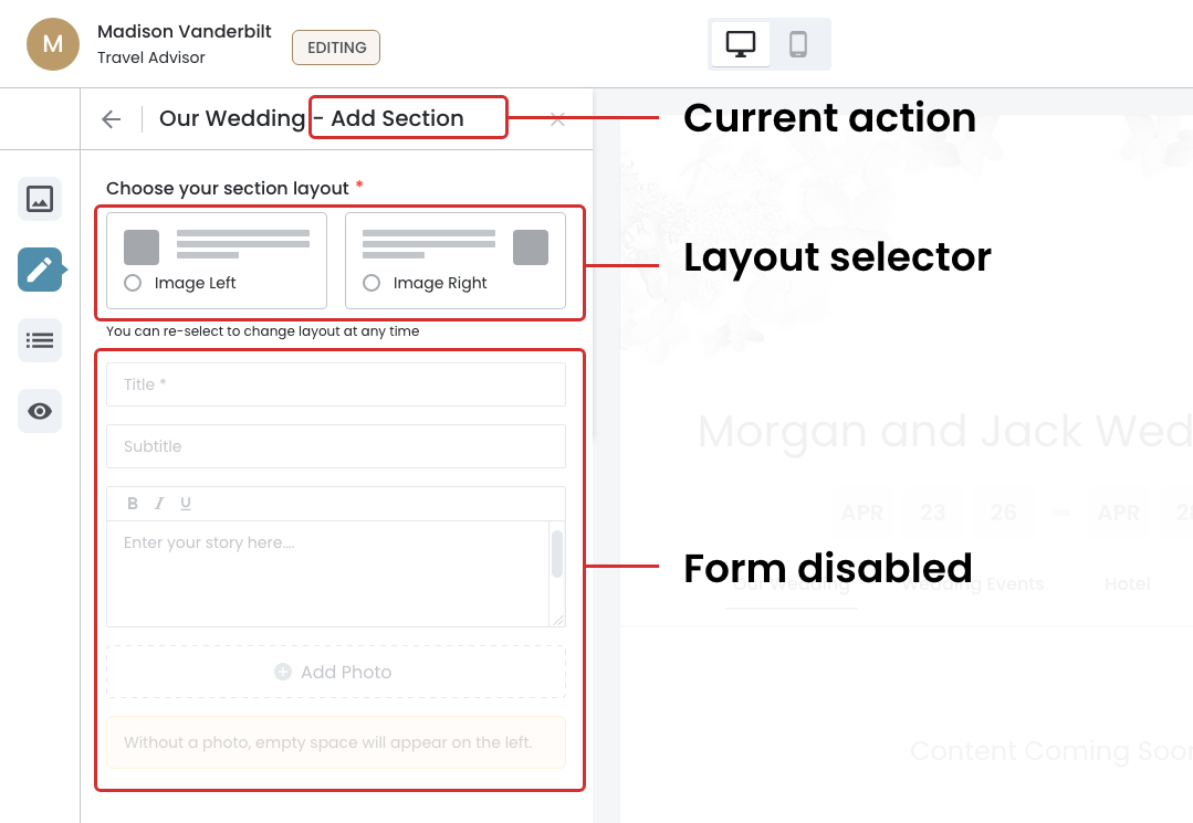
Section Form
The form is fully enabled because the 'Image Right' has been selected.
February 24th, 2026
Form Interaction & Persistent Action
Build and Publish
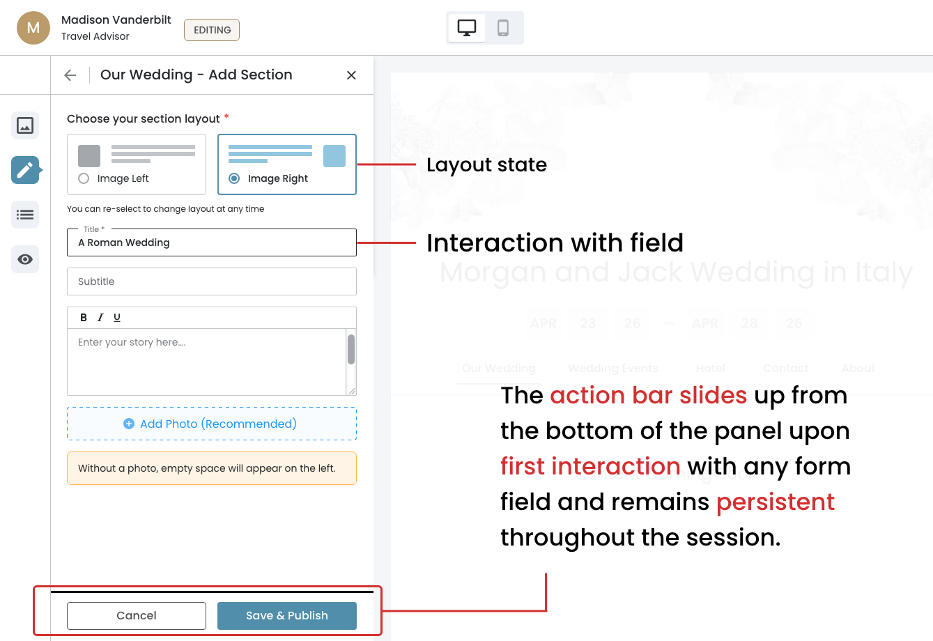
Once the layout is selected, the user can begin filling in the section form. Upon first interaction with any field, the action bar slides up. This ensures the user always has a clear path to either commit to or discard their changes. Title is the only required field; Subtitle, body text, and photo are optional but recommended for a complete and visually balanced section.
Clear Exit or Commit Path
Action Bar Behavior: Slides up from the bottom of the panel and remains persistent — keeping the Cancel and Save & Publish actions visible at all times.
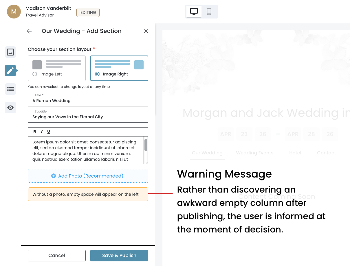
Populated State
Going from an empty form to a fully populated one in a clean and clear progression. The warning message serves as a proactive guide, alerting the user to a visual consequence before it happens on the live site. This reduces the likelihood of a poor first publish and keeps the user confident throughout the editing experience.
February 25th, 2026
Photo Upload Interaction
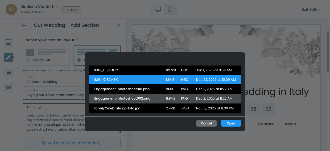
- The Trigger — Clicking the "Add Photo" prompt opens the native file browser.
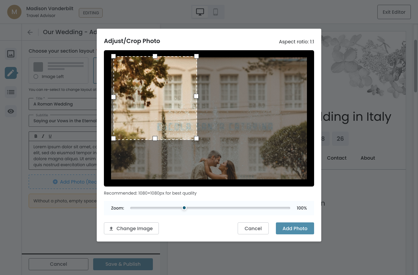
- The Initial Crop State — The crop window defaults to the top left of the image at 100% zoom. This is intentional, not arbitrary.
- The Aspect Ratio is Fixed at 1:1 — This is locked and not user–adjustable. This impacts the photo the user chooses and how they crop it.
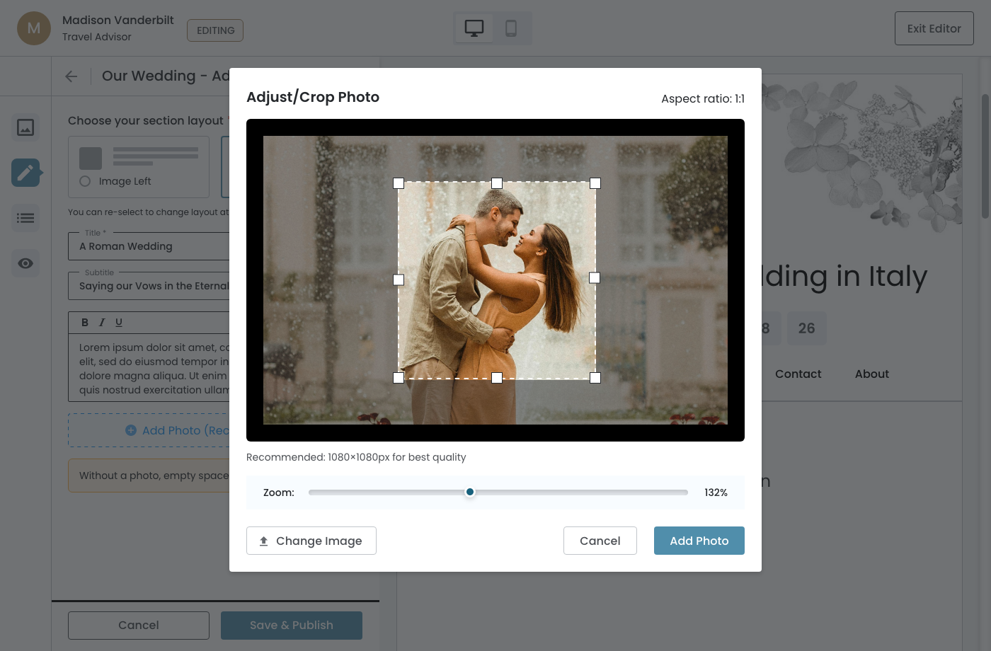
- The Zoom Control — The slider gives the user precise control, and the percentage is displayed in real time.
- Change Image — The "Change Image" button allows the user to swap the photo without canceling out of the modal entirely. This keeps the user in flow.
- The Modal Context — The editor and action bar remain visible but dimmed in the background, keeping the user oriented within the larger flow.
Native File Browser
Clicking the "Add Photo" prompt opens the native file browser.
Initial Crop State
The crop window defaults to the top left of the image at 100% zoom with the aspect ratio fixed at 1:1.
Reposition and Adjust
The slider gives the user precise control, and the percentage is displayed in real time. The editor remains visible, but dimmed in the background
February 25th, 2026
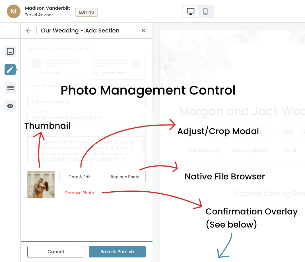
Photo Added State
Key UX features:
- Thumbnail ‐ Gives visual confirmation that the correct photo was added.
- Three Actions ‐ The full range of what a user might need to do:
- Crop & Edit ‐ Returns the user to the Adjust/Crop modal, keeping them within the same photo context to refine their selection.
- Replace Photo ‐ Bypasses the Adjust/Crop modal entirely and goes straight to the native file browser, starting the upload flow fresh.
- Remove ‐ Does not execute immediately. The confirmation overlay prevents accidental deletion of a photo.
Photo Management Control
This is a post‐upload management interface, not just button.
February 25th, 2026
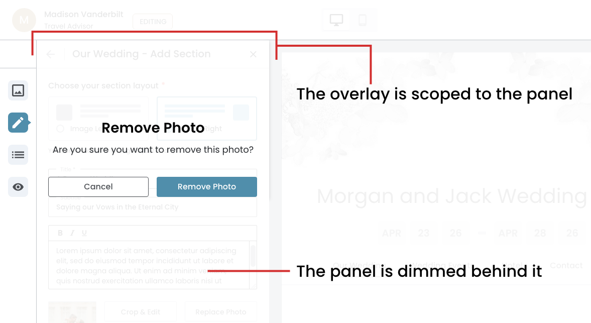
Remove Photo
Confirmation Overlay
The confirmation step on Remove Photo is an intentional friction point that protects the user from an irreversible action.
- The overlay is scoped to the panel — it doesn't take over the entire screen like a modal. It sits within the panel itself, which keeps the interaction contained and contextually relevant.
- The panel is dimmed behind it — the form, photo management controls, header, and action bar all fade back, reinforcing that the user must resolve this decision before continuing. Nothing else is accessible until they do.
Critical Safeguard
The destructive action is styled as the primary button, which is a deliberate choice to match the user's intent at this moment in the flow.
What happens when the user clicks on 'Remove Photo' button?
The panel returns to the original "Add Photo" prompt state ‐ essentially resetting the photo area back to the empty dashed card.
February 25th, 2026
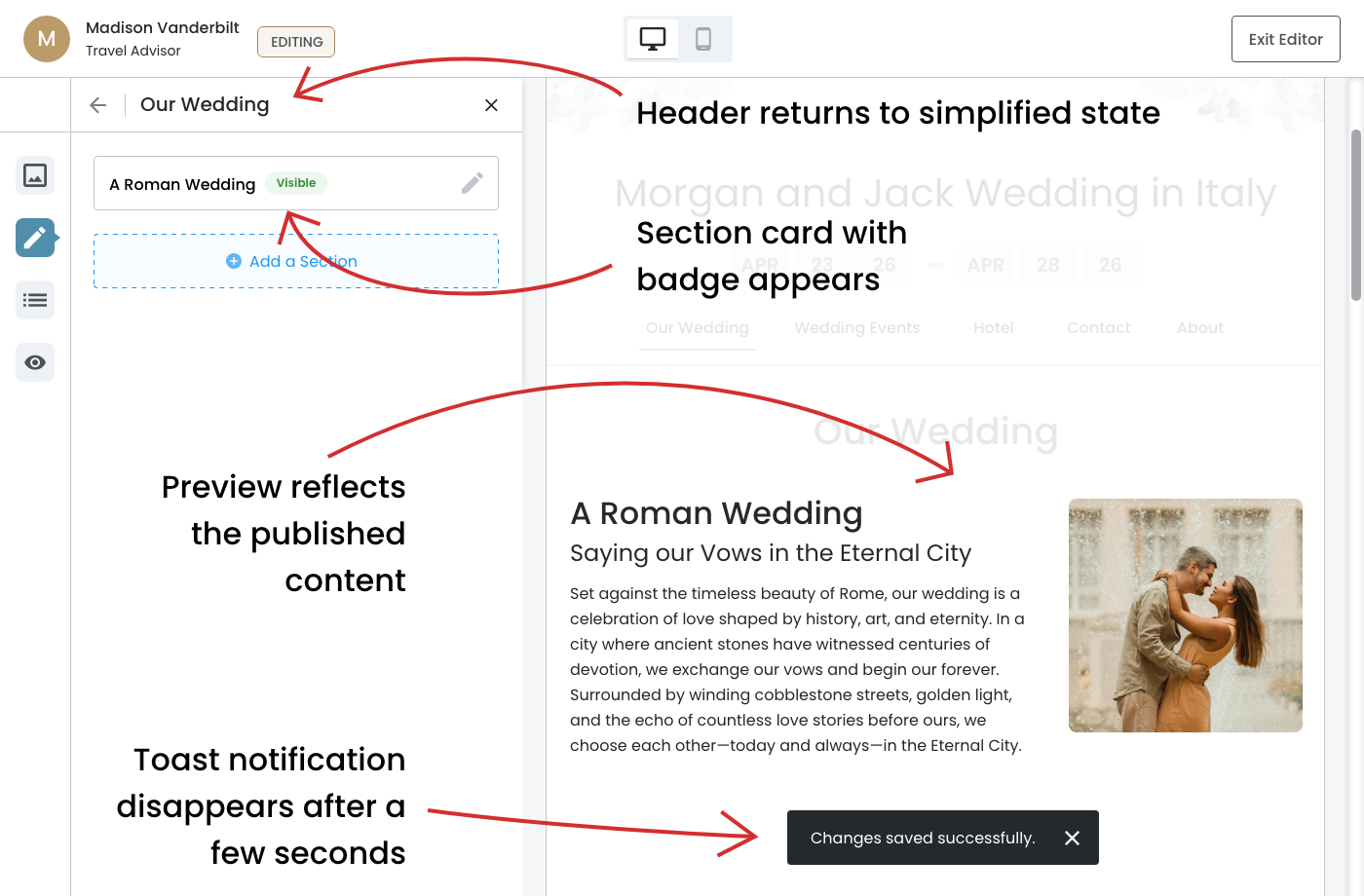
Saved & Published State
The panel header returns to its simplified state—"Our Wedding"—confirms the user has exited the add flow and is back at the page level, reinforcing the wayfinding logic that was built into the header throughout the entire flow.
- The toast notification is transient — "Changes saved successfully" appears briefly and then disappears automatically after a few seconds.
- The Page Sections panel updates immediately — "A Roman Wedding" now appears as a section card with the "Visible" badge, confirming the section is live on the event website.
- The preview reflects the published content in real time — The right side now shows the fully rendered two-column section with the title, subtitle, body text, and photo exactly as the user built it.
- The "Add a Section" prompt returns — below the newly created section card, the prompt is available again, signaling to the user that they can continue building.
The Payoff Moment
The user can see their work living on the event website without leaving the editor.
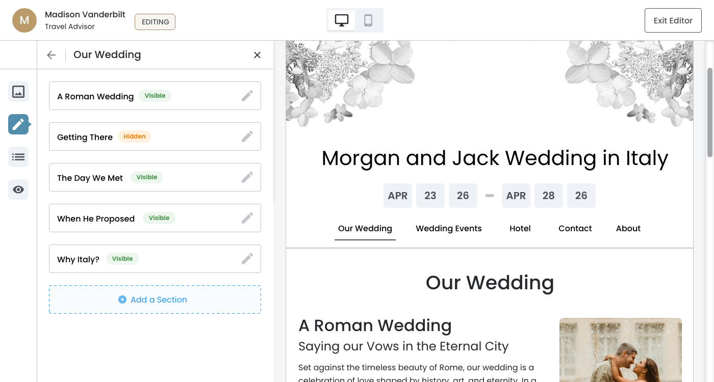
Section Cards
The pencil icon on the section card is the visual cue that the section is editable, and clicking anywhere on the card will open the Edit Section panel.
Dev Note: Click on the "See Design" button to see the hover effects.
February 26th, 2026
Edit Section Flow
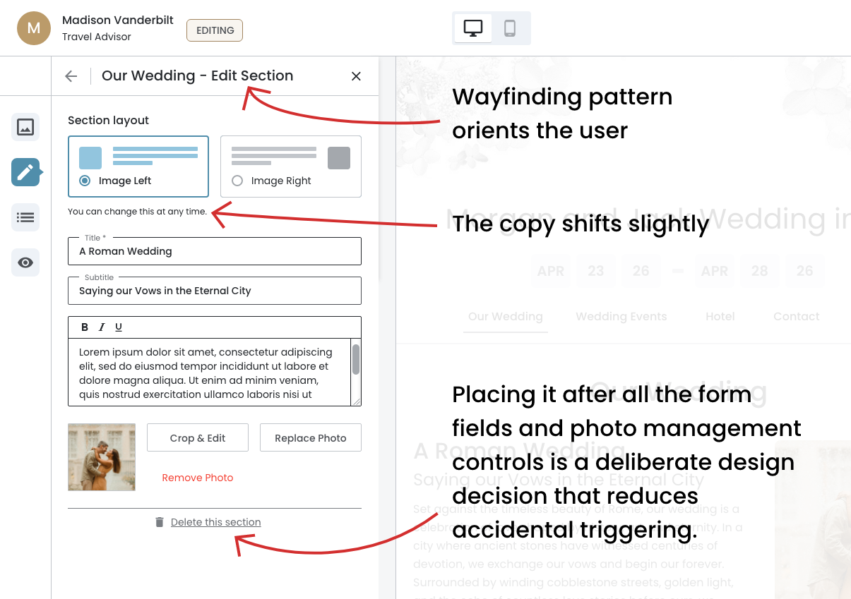
Selecting a section card opens the Edit Section panel, where the user can modify content, swap the layout, update the photo, or delete the section entirely.
- The form arrives pre-populated — Unlike the Add Section flow where the form starts empty, the Edit Section panel loads with all existing content already filled in.
- The layout selector reflects the current state — Worth noting that the copy shifts slightly to "You can change this at any time" in the Edit flow.
- The persistent action bar behavior carries over — Any interaction with a field, layout change, or photo management action triggers the action bar to slide up.
- "Delete this section" is positioned at the bottom — Placing it after all the form fields and photo management controls reduces accidental triggering.
Edit Section Panel
The header convention is consistent — "Our Wedding — Edit Section" follows the same wayfinding pattern established in the Add Section flow, immediately orienting the user within the context of both the page and the current action.
February 26th, 2026
Delete this Section
Confirmation Overlay
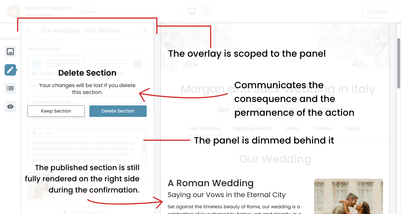
- The language is more explicit — "Your changes will be lost if you delete this section" communicates the consequence and the permanence of the action. This is a strong warning that deleting a section is a significant action.
- The button labels are specific — "Keep Section" and "Delete Section" are more descriptive than a generic "Cancel" and reinforce exactly what each action does. This reduces hesitation and confusion at a critical decision point.
- The preview remains visible and unchanged — The published section is still fully rendered on the right side during the confirmation, which subtly reminds the user what they are about to lose.
Confirmation Overlay Pattern
The pattern is consistent — The overlay behavior mirrors the Remove Photo confirmation, with the panel dimmed behind it and nothing else accessible until the user resolves the decision.
February 26th, 2026
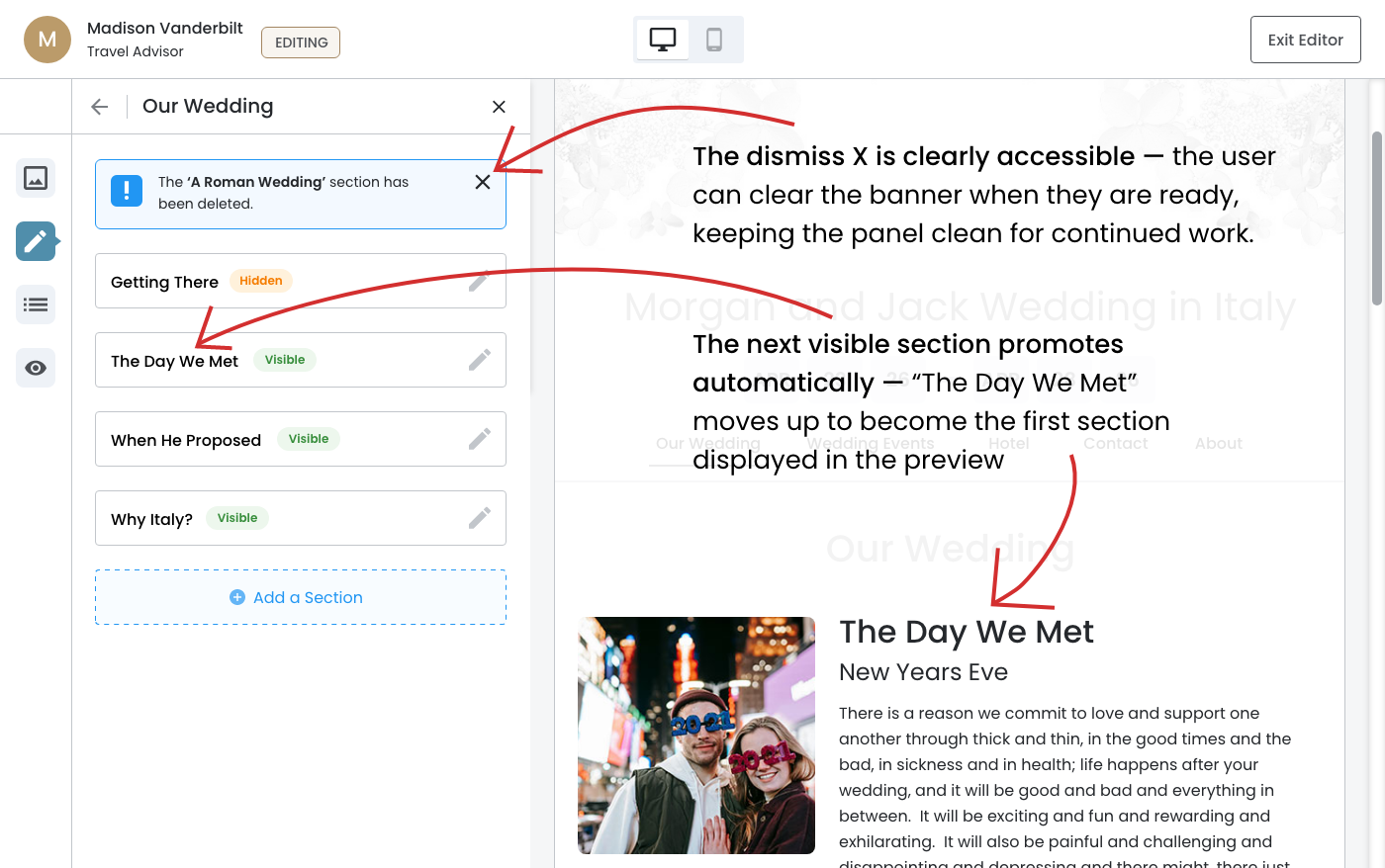
Post–Deletion Section
The moment after the deletion has been confirmed and the panel has returned to its updated Page Sections view with the dismissible banner in place.
- The preview reflects the deletion in real time — the moment the section is deleted and the banner appears, the preview immediately reorganizes to show the remaining sections in order. This is a simultaneous update, not a delayed one.
- The next visible section promotes automatically — "The Day We Met" moves up to become the first section displayed in the preview (on the right side), which confirms that the order of sections in the panel corresponds directly to their order on the event website.
- The "Getting There" section remains hidden — notably it is present in the panel as the first card but does not appear in the preview because its status is "Hidden."
The Moment After Deletion
The preview updates simultaneously with the deletion ‐ "A Roman Wedding" is gone and the next visible section "The Day We Met" now leads the content area.