Themes
Enabling event branding through intuitive visual header selection.
In this page
December 31st, 2025
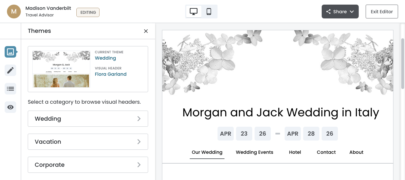
Theme Configuration Panel
The Theme configuration panel provides travel agents and co‐editors with a streamlined way to customize their event website's visual identity. Given that co‐editors (often the bride or corporate event lead) typically join after the initial theme selection during onboarding, this panel needed to balance discoverability with efficiency.
The design employs a two‐level hierarchy: theme categories (Wedding, Vacation, Corporate) serve as the top level, with visual headers‐the decorative designs that express each theme‐nested within. This structure acknowledges that while the theme category aligns with the event type, the specific visual header is what truly personalizes the experience.
Key UX Decisions
- Preview‐before‐commit interaction pattern with explicit Save/Cancel actions prevents accidental changes while allowing users to explore options freely
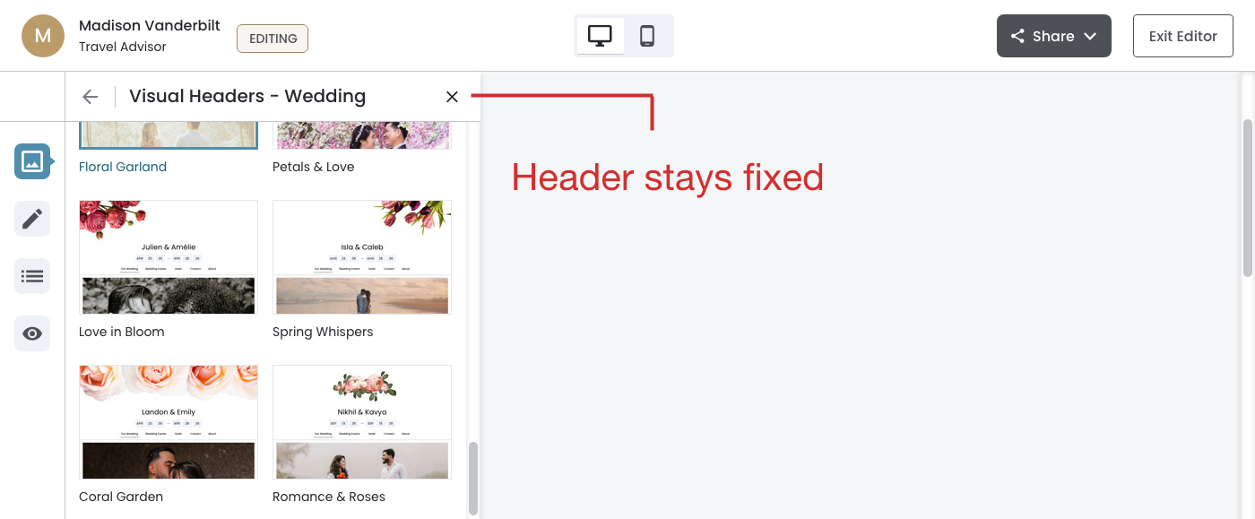
- Fixed header and footer ensure navigation and actions remain accessible during scrolling, critical when browsing up to 15+ visual header options
- Real‐time canvas preview combined with persistent "Current Header" indicators across panel states provides continuous orientation, ensuring users always understand both their active selection and any staged changes
First Level
Second Level
January 14th, 2026
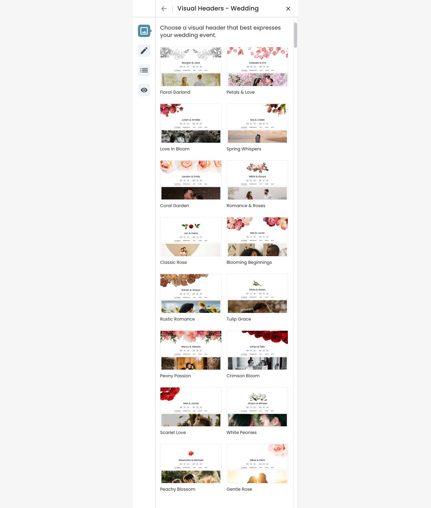
Thumbnail Grid Layout
Wedding
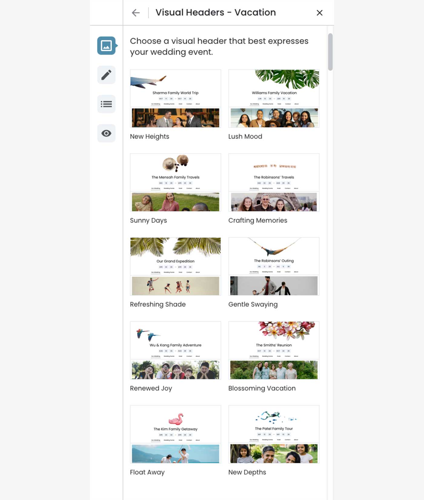
The visual headers are displayed in a fixed, curated order (not alphabetical or randomized). The arrangement has been intentionally balanced for visual variety‐alternating between different floral styles, color palettes, and compositions. Maintain this exact sequence in implementation.
Vacation
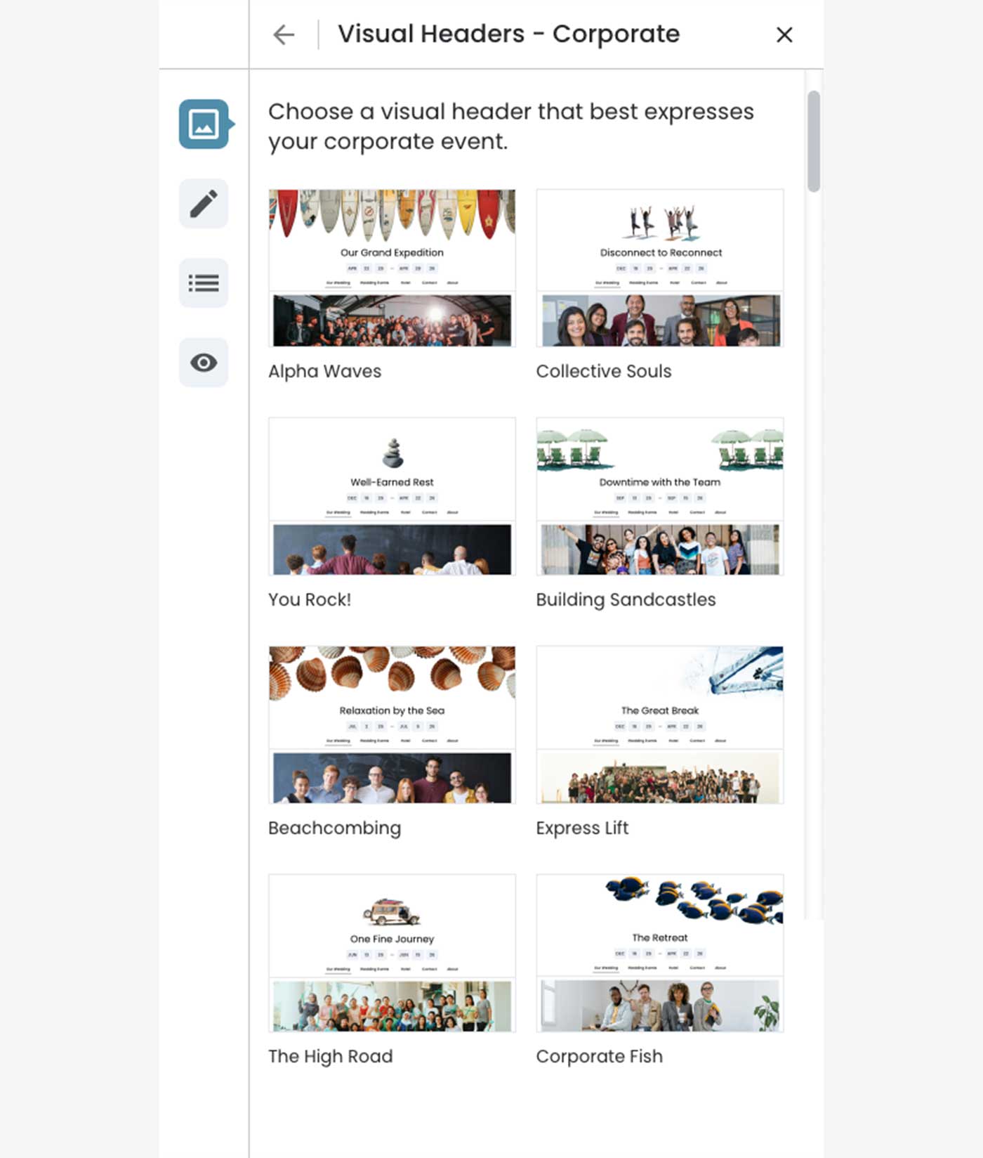
Corporate
January 6th, 2026
Fixed Configuration Panel
What this shows:
- Fixed configuration panel ‐ The Theme panel remains anchored to the left while scrolling
- Independent scroll contexts ‐ The panel content (thumbnails) scrolls independently from the canvas preview
- Persistent header ‐ "Visual Headers hyphen; Wedding" with navigation stays visible
- Canvas scrolls freely ‐ Users can navigate the preview without losing access to editing controls
January 7th, 2026
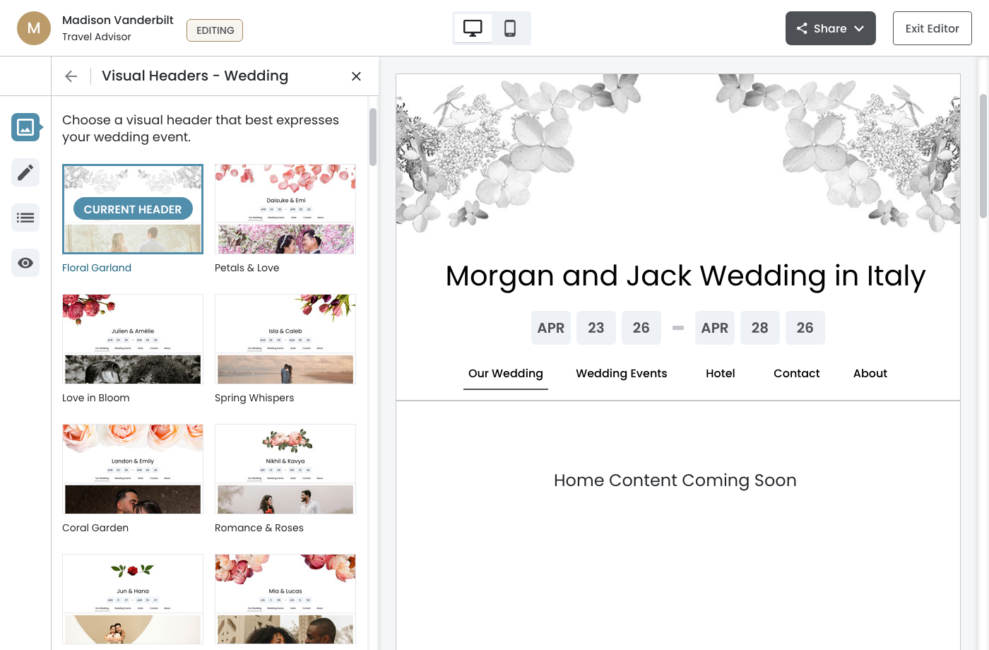
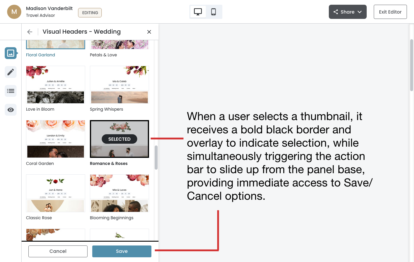
Select + Confirm Pattern
Action Bar
When a user selects a thumbnail, it receives a bold black border and overlay to indicate selection, while simultaneously triggering the action bar to slide up from the panel base, providing immediate access to Save/Cancel options.
Why this pattern works well here:
- Allows exploration ‐ Users can click through multiple options to preview them before committing
- Clear intent ‐ Explicit Save action makes it clear when changes are actually applied
- Safety net ‐ "Cancel button provides an escape route if users change their mind
January 7th, 2026
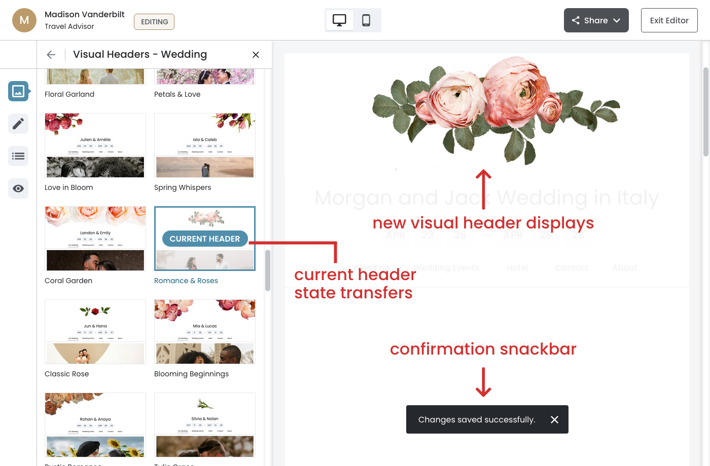
Action‐Sequence Focused
Clicking Save triggers a coordinated sequence.
On Save click:
- When the user clicks Save, the action bar slides down and dismisses
- The 'Current Header' state transfers to Romance & Roses (teal border + badge)
- The canvas preview immediately updates to display the new header design
- A confirmation snackbar ('Changes saved successfully') appears briefly at the bottom of the canvas
January 7th, 2026
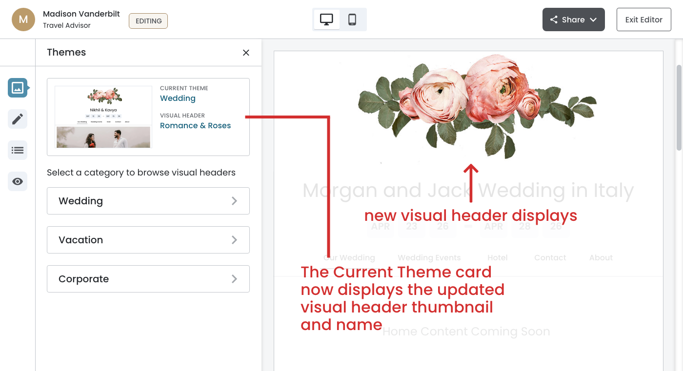
Complete The Loop
The visual header selection flow demonstrates closed-loop feedback—a critical UX principle that ensures users always understand the impact of their actions. After clicking Save, the system completes the loop by returning the user to the main Themes panel with all state fully synchronized:
- The Current Theme card now displays the updated visual header thumbnail and name (Romance & Roses)
- The canvas preview reflects the new header design
- The two‐level information hierarchy (Theme Category + Visual Header) reinforces what was changed
This immediate visual confirmation eliminates ambiguity and builds user confidence, as they can clearly see their selection has been applied without needing to navigate elsewhere or refresh the page.