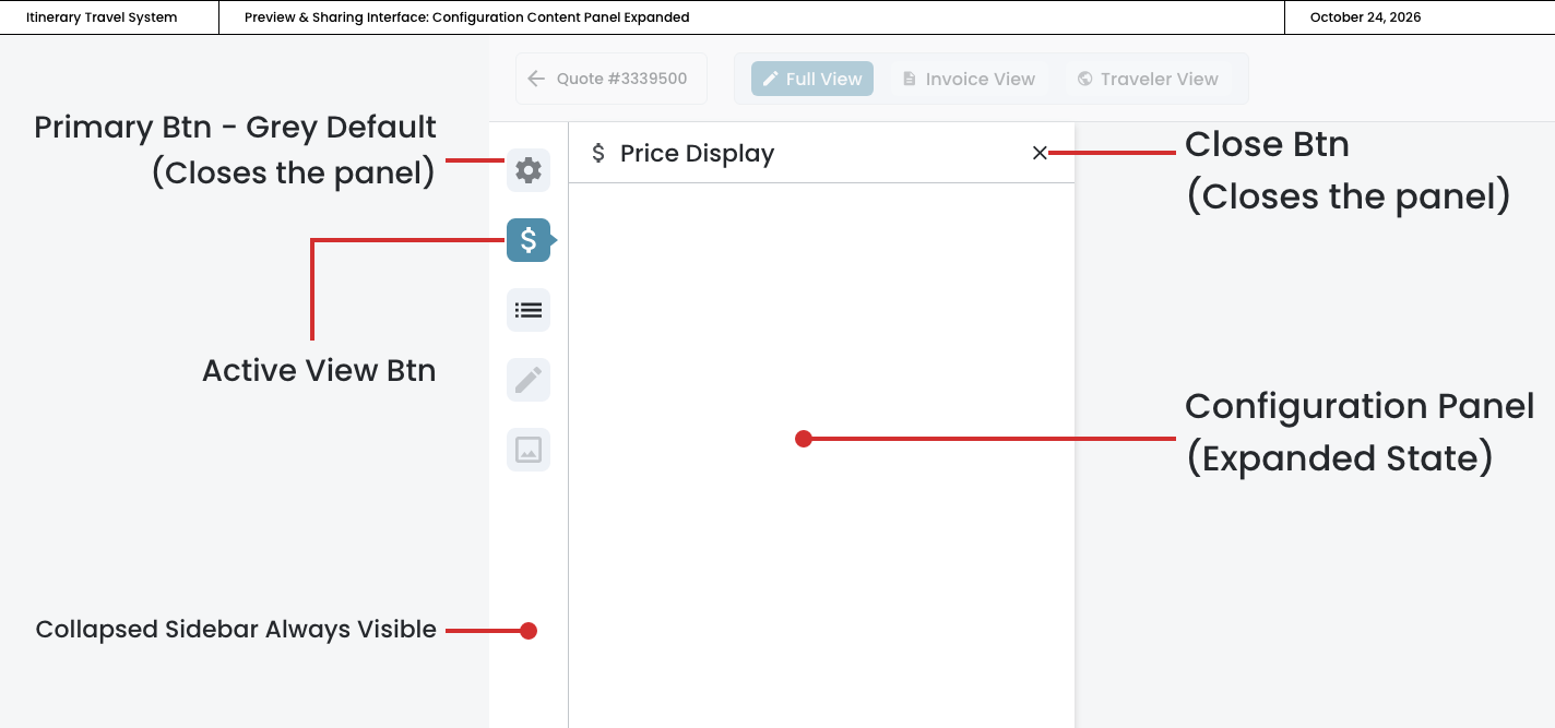
Configuration Content Panel
Gives travel advisors focused, distraction‐free control over their itinerary presentation.
In this page
Oct 24th, 2025
Expanded State
Respecting the Advisor's Workflow
When an advisor clicks a configuration icon, the panel slides in smoothly, showing only the options relevant to that specific task‐whether adjusting price visibility, reordering components, or customizing content. This single‐task approach eliminates the cognitive load of scrolling through unrelated settings, allowing advisors to quickly make their changes and return to previewing.
Key UX Features:
- Icons Act as View Switchers
- Click the Price Display icon → panel opens showing ONLY price options
- Active view has aqua background + indicator pointer on the right edge
- Focused Content
- Each view shows only its relevant controls
- No accordion clutter or competing sections
- Much cleaner, more focused experience
- Better Visual Hierarchy
- Icon sidebar (always visible) = navigation
- Content panel (conditional) = focused task area
- Preview area (always visible) = results
- Smooth Transitions
- Panel slides in with animation when opening
- Content swaps when switching between views
- Feels more app‐like, less document‐like
Benefits of this Approach
- Simpler Mental Model: One task at a time
- Less Overwhelming: User sees only what they need
- Easier to Scale: Add Phase 2/3 features without redesign
- More Focused: No scrolling through unrelated options
Configuration Content Panel ‐ Expanded State
Oct 24th, 2025
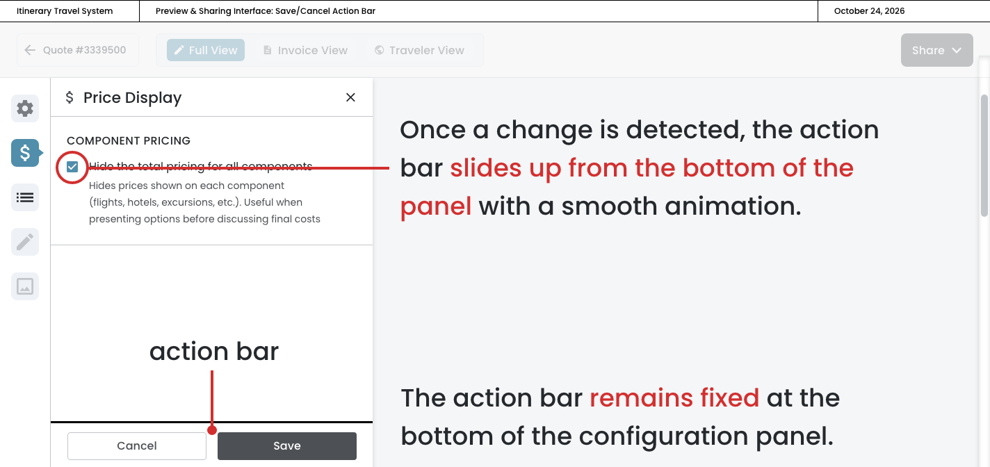
Cancel/Save
Action Bar: UX Rationale
The Save/Cancel action bar is a critical component of the configuration panel's user experience. This pattern provides users with explicit control over when changes are applied, which is essential for a system where travel advisors are crafting client‐facing itineraries that represent significant financial commitments.
How It Works:
- The action bar remains hidden until the user makes their first change (checking/unchecking a checkbox, toggling component visibility, or reordering components)
- Once a change is detected, the action bar slides up from the bottom of the panel with a smooth animation, making its appearance feel responsive and intentional
- The action bar remains fixed at the bottom of the configuration panel, staying visible even as users scroll through the content above
- Users can continue making multiple changes while the action bar persists, allowing them to batch their edits
- The action bar only disappears when the user clicks "Save" (committing all changes) or "Cancel" (reverting to the last saved state)
Cancel/Save Action Bar
Oct 24th, 2025
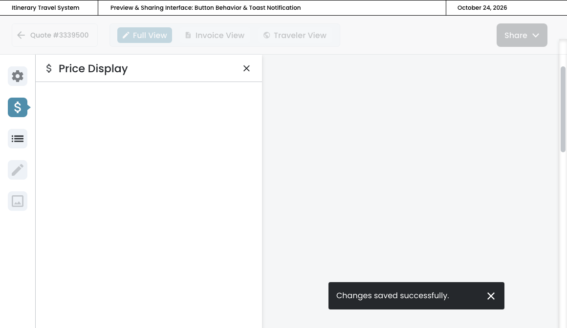
Button Behavior & Notification
Save Button Behavior Sequence
- User clicks "Save"
- Button shows brief loading state ("Saving..." with spinner)
- Action bar slides down and disappears
- Toast notification appears: "Changes saved successfully""
- Includes a small X to manually dismiss
- Toast auto‐dismisses after 3‐4 seconds
- Preview panel updates to reflect saved changes
Loading State ‐ Spinner
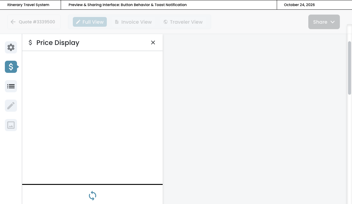
Toast Notification
Oct 24th, 2025
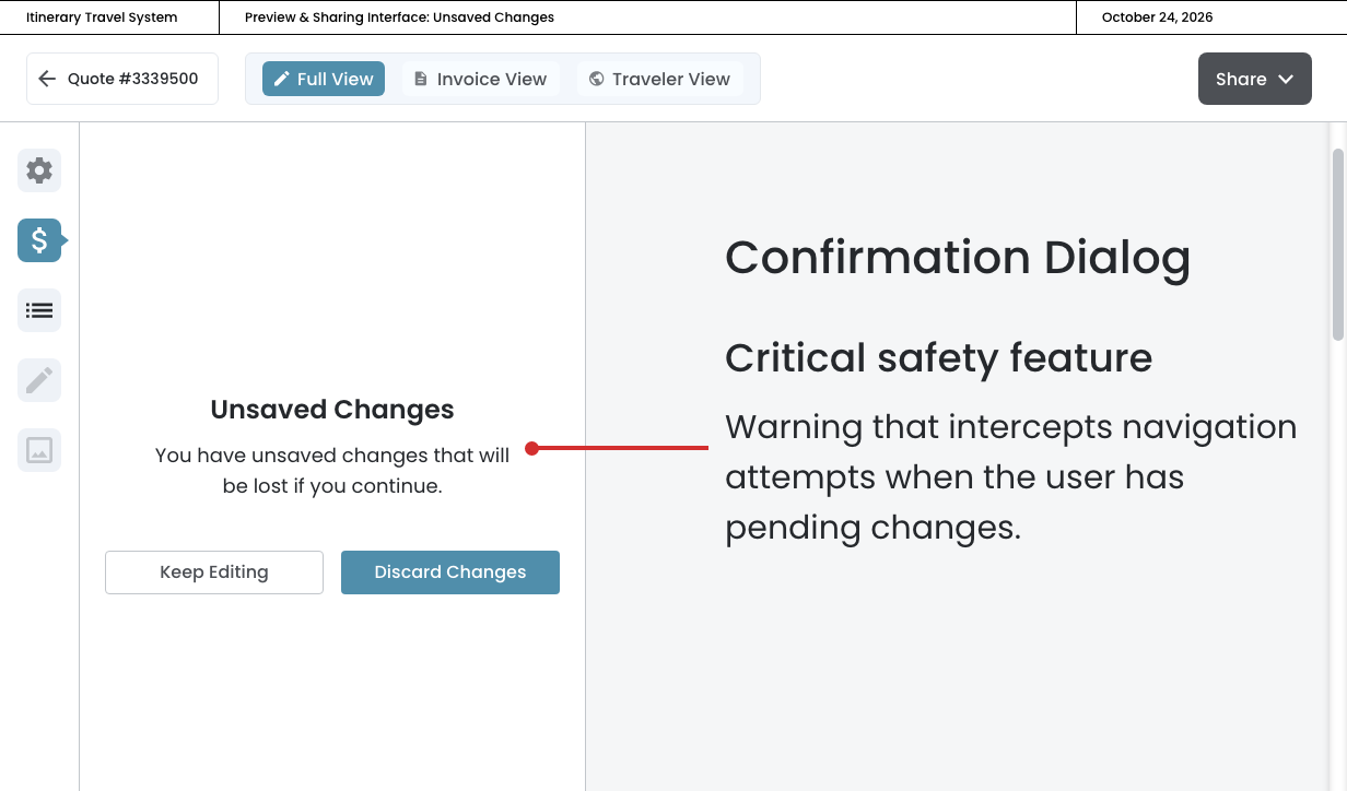
Unsaved Changes Warning
Confirmation Dialog
This confirmation dialog is a critical safety feature for the Save/Cancel design pattern. We're implementing an unsaved changes warning that intercepts navigation attempts when the user has pending changes.
How It Should Work:
Trigger Conditions (when to show the confirmation dialog):
- User has unsaved changes (action bar remains but is covered by the dialog)
- User attempts to navigate away by:
- Clicking a different panel button (Components, Settings, etc.)
- Clicking a different view tab (Invoice View, Traveler View)
- Clicking the Back arrow
- Clicking the X close button on the panel
User Choices:
"Keep Editing" button (stay and keep editing):
- Dialog closes
- User remains in current panel/view
- Unsaved changes are preserved
- Action bar remains visible at bottom
- User can continue editing or click Save/Cancel
"Discard Changes" button (discard and leave):
- All unsaved changes are discarded/reverted
- User navigates to their intended destination
- Action bar disappears (since changes were discarded)
Cancel/Save Action Bar