Interface Structure
A non‐scrolling app interface where the workspace fills the screen and each panel scrolls independently.
In this page
Oct 23rd, 2025
View‐Constrained Layout
Full‐Height Layout
The interface uses a fixed‐height application layout where the top bar, sidebar, and preview pane remain anchored to the browser window. When users resize their browser, the interface adapts proportionally, but the panels themselves don't get cut off or require page‐level scrolling.
Independent Panel Scrolling
Each section has independent internal scrolling, so users can navigate the itinerary in the preview pane while keeping the configuration controls always accessible in the sidebar:
Oct 23rd, 2025
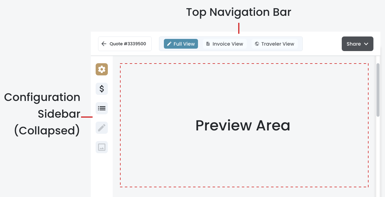
Four Components
The Preview & Share interface is organized into four primary components that work together to provide travel agents with efficient control over itinerary presentation while maintaining a clean, focused workspace:
Top Navigation Bar
- Back navigation with clear destination label ("Back to Quote Builder")
- View switcher tabs (Full View, Invoice View, Traveler View) for toggling between presentation formats
- Share button with dropdown menu providing email and download options
Configuration Sidebar (Collapsed)
- Persistent vertical bar (72px wide) always visible on the left side
- Icon‐based navigation buttons for each configuration section (Price Display, Components, etc.)
- Visual indicators show active sections and future phase availability
- Contextual tooltips explain each section and availability per view
Preview Area
- Main workspace displays real‐time preview of selected view (Full, Invoice, or Traveler)
- Responsive to all configuration changes made in the left panel
- Provides visual context for what clients will receive
- Scales to fill available space when configuration panel is collapsed
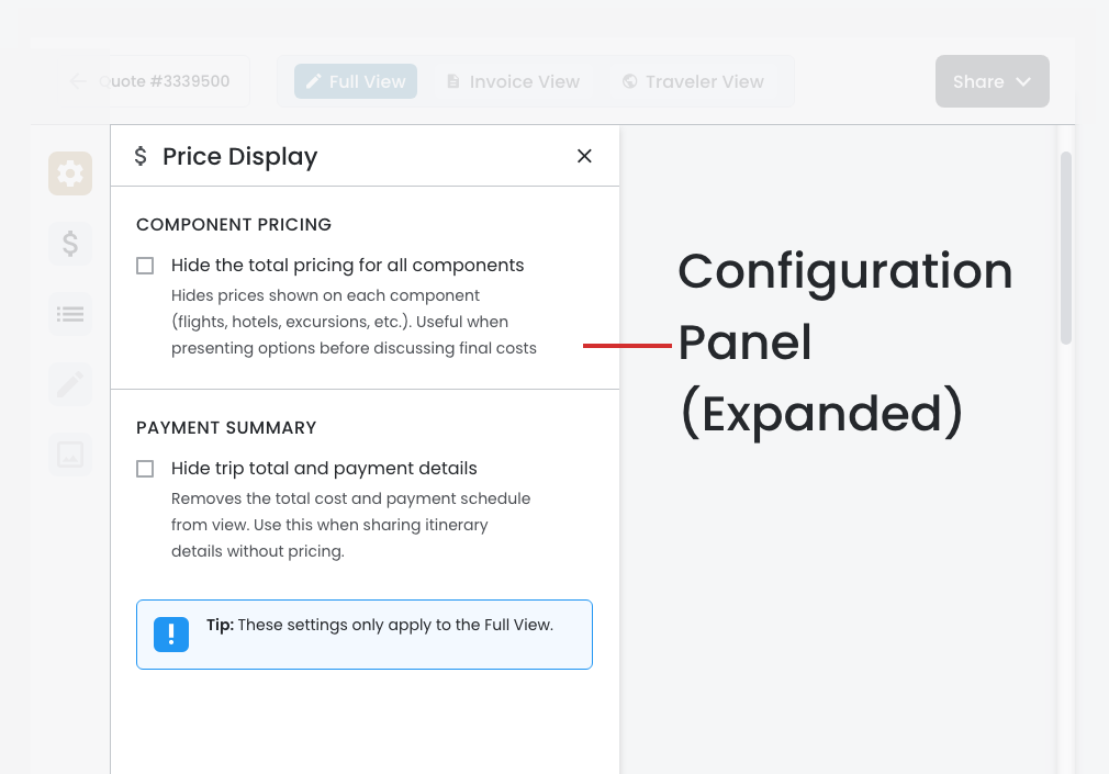
Configuration Panel (Expanded)
- Slides in from left (464px wide) when user clicks a configuration icon
- Displays focused, section-specific controls (no competing accordion sections)
- Each section gets dedicated space: Price Display options, Component visibility/ordering, etc.
- Clean header shows section name with close button
- Panel automatically closes when switching to views where configurations aren't applicable