Top Navigation Bar
Key design elements across all views.
In this page
Oct 23rd, 2025
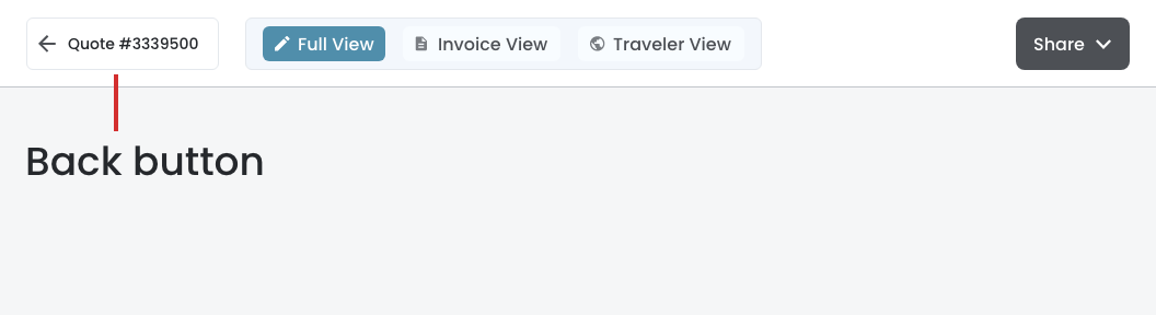
Back Arrow
To reduce cognitive load, the quote or booking number should display following the left arrow. This will convey to the user where it (the arrow) goes "back" too. Look at the design to see the hover effect of the arrow and number.
Oct 23rd, 2025
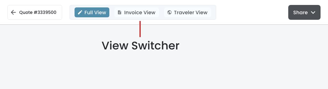
View Switcher
Since these three views have very different purposes and layouts, the view switcher should:
- Three pill‐style tabs:
- Context‐aware primary actions change based on the active view:
- Full View (pencil icon) ‐ "Proposal for selling the trip"
- Invoice View (document icon) ‐ "Booked trip with payment details"
- Traveler View (globe icon) ‐ "Available 45 days before the trip"
Oct 23rd, 2025
Share
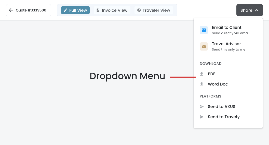
Dropdown Menu
When user clicks on the Share button, a split and secondary actions dropdown menu should appear. Making the email menu link as the primary is highly recommended.
Key Design Decisions
- Menu Structure
- Email to Client ‐ Prominent primary action
- Travel Advisor ‐ Secondary action
- Download Section ‐ PDF and Word Doc
- Platform Section ‐ AXUS and Travefy
- Visual Hierarchy
- Icons with colored backgrounds (blue for client, gold for travel advisor)
- Larger touch target for primary action (Email and Travel Advisor)