Configuration Sidebar (Collapsed)
A purposeful left panel sidebar with expectations for growth.
In this page
Oct 24th, 2025
Left Panel Strategy
Sidebar is Always Visible
We're thinking strategically about phased rollouts and future‐proofing. Given our phased approach, the collapsible left panel is the right direction:
- Scalability ‐ As we add title editing, intro messages, image uploading in phases 2‐3, the collapsed left panel can naturally accommodate these without redesigning the entire interface
- User Training ‐ Users learn "configurations live on the left" once, rather than re‐learning the interface with each phase
- Minimal Disruption ‐ Each phase adds features to a familiar location
Oct 24th, 2025
Visual Identity
Icon Strategy for Collapsed State
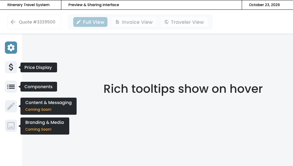
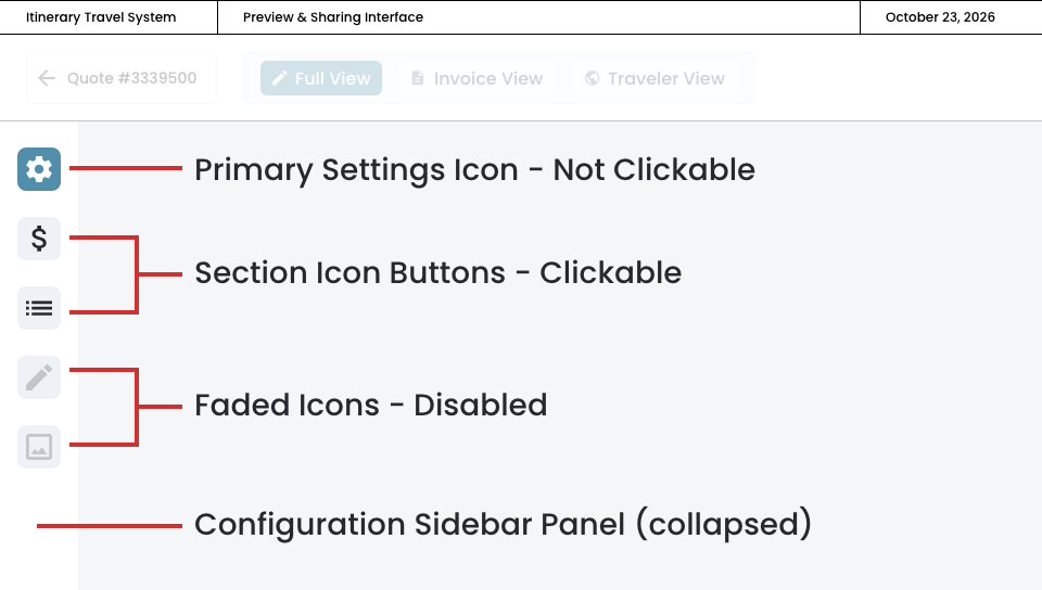
Each icon acts as a dedicated view within the configuration panel. When collapsed, the icons will represent configuration categories. This design makes the left panel sidebar feel intentional, not sparse.
Single‐view approach
- Primary Settings Icon
- Always at the top
- Icon Stack Organization
- Phase 1 (Active): Price Display & Components icons in default gray
- Phase 2‐3 (Coming Soon): Grayed out
- Rich Tooltips
- Show on hover
- Include section name
- "Coming Soon" message for inactive features
- Sets user expectations without cluttering
Left Panel Sidebar (Collapsed)
Tooltips